Showing posts with label Digipak Project. Show all posts

Friday, 20 April 2018

Poster First Draft


This is the first draft for my poster as part of my ancillary texts. I have received multiple pieces of feedback in order to improve it. Those pieces of feedback include; reducing the size of the font, including a header saying 'listen now' and changing the picture as it is not professional along with the quality of it. 


Thursday, 19 April 2018

Digipak First Draft


This is the first draft for my digipak project. Since producing it I have received multiple pieces of feedback in order to improve it and make it more realistic. Firstly, I have been advised to add some panels as it is necessary when creating a digipak. Furthermore, I need to also include multiple things, such as small print on the back cover, the artist's name on the front cover and to add a second disc to accompany the album disc. 


Friday, 19 January 2018

Digipak Designing

This week, I continued to make progress with my digipak project. This is a result of myself, drawing what I aim for my digipak to look like and naming the title of the album 'Blackout'. I also came up with the list of songs that will feature on the back of the album. This is only a first design and may look different when I use photoshop to create it.

Wednesday, 29 November 2017

Digipak

Alongside, the planning and production of myself and my groups music video, I have started the process of planning my digipak and what it will look like. Firstly, the first part of planning is understanding what a digipak is and what it looks like. 

Definition; A digipak is a patented style of optical disc packaging, and they typically consist of a gatefold (book-style) paperboard or card stock outer binding, with one or more plastic trays capable of holding a CD or DVD attached to the inside.

Here is an example of a digipak:


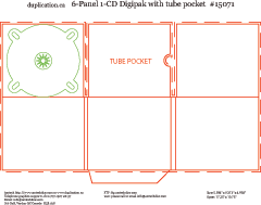
Here is an example of the template of a digipak:


As you can tell from the picture this digipak has six panels, which features a disc, a tube pocket and the inside covers and back. This will feature pictures of the artist and location as well as the songs in the album and the logo of the artist. 

Tuesday, 28 November 2017

Iconic Album Covers

In this blog post I will be researching iconic album covers from the past and analysing them and suggesting what makes them iconic.


This is the Beatles album artwork from their album labelled "Abbey Road" and this was released in 1969. This is a very iconic piece of album artwork since firstly because it features the four band members (supposedly) and they were the first real popular boy band in the music industry. In addition, it is also very iconic as it is a very aesthetic album cover. The array and variety of outfits and the blue sky along with the green trees make it very pleasing to look at and would certainly attract the eyes of customers in music shops. Lastly, it is very iconic due to the fact certain aspects of the have caused major controversy and have been subject to many conspiracy theories.


This famous album cover is very iconic and was released in 1991 by Nirvana and it is called "Nevermind" and is probably Nirvana's most iconic album artwork. One of the reasons why it is so iconic is the fact its very unique because there has never been an album cover with a baby underwater with a dollar bill. The uniqueness made it very iconic and a stand out on shelves.


Despite this not being an actual album cover, I found this one on internet when researching them and this one caught my eye and I really like this one. This is because it has many different iconic figures on the cover as well as an iconic setting. People would find this album cover very attractive and eye catching because nothing like this has been done before and people would be attracted to characters such as Kim and Kanye, the Joker, Marilyn Monroe and Darth Vader. 

Wednesday, 22 November 2017

Digipak Tasks

1. Read article - picket points and add to blog.
2. Find iconic covers and analyse and what made it iconic
3. Design brief, hand draw.

Digipak Research

There are well-established industry criteria for every product: logos, posters, CDs, business cards and stationery, advertising and websites. Here are some main criteria to help judge a design success.

1. Is it unified with the content or message you are trying to get across? This creates an immediate connection and sense of belonging.

2. Is there an information and visual hierarchy? This means there's a focal point or image that grabs your attention first, and then your eye is led around the design in the order of what is important after seeing the main image of reading the main text.

3. Does the design have graphic impact? Is it distinctive or memorable? There are many CDs competing with yours for attention, lots of these are sent out to producers and designers, this means it must be a major contender.

4. Is it appropriate for whom you want to attract and the environment in which it will be presented? A poster or CD for a country audience will not have the same look and feel presentation as for a heavy metal one.

The golden era of cover art design began in the early to mid 1960s and lasted into 1980s. During this time the major format for music was 12 inch, long play disc or LP.Cover art became a part of the musical culture of the time. Often used to express graphically the musician's artistic intent, it helped connect and communicate to listeners the message or underlying theme of the album.

Album cover art, now almost exclusively CD and CD packaging artwork, went through a period of change and rebirth in the 1990s.

Final Music Video

Here is the final draft of our music video of the song 'Heathens' by Daze: