Wednesday, 29 November 2017

Digipak

Alongside, the planning and production of myself and my groups music video, I have started the process of planning my digipak and what it will look like. Firstly, the first part of planning is understanding what a digipak is and what it looks like. 

Definition; A digipak is a patented style of optical disc packaging, and they typically consist of a gatefold (book-style) paperboard or card stock outer binding, with one or more plastic trays capable of holding a CD or DVD attached to the inside.

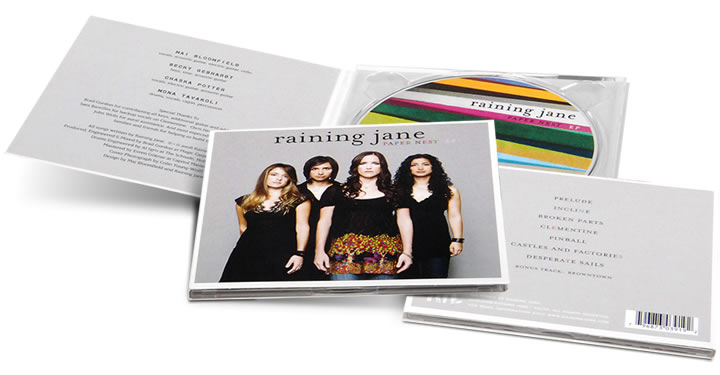
Here is an example of a digipak:


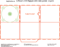
Here is an example of the template of a digipak:


As you can tell from the picture this digipak has six panels, which features a disc, a tube pocket and the inside covers and back. This will feature pictures of the artist and location as well as the songs in the album and the logo of the artist. 

Tuesday, 28 November 2017

Iconic Album Covers

In this blog post I will be researching iconic album covers from the past and analysing them and suggesting what makes them iconic.


This is the Beatles album artwork from their album labelled "Abbey Road" and this was released in 1969. This is a very iconic piece of album artwork since firstly because it features the four band members (supposedly) and they were the first real popular boy band in the music industry. In addition, it is also very iconic as it is a very aesthetic album cover. The array and variety of outfits and the blue sky along with the green trees make it very pleasing to look at and would certainly attract the eyes of customers in music shops. Lastly, it is very iconic due to the fact certain aspects of the have caused major controversy and have been subject to many conspiracy theories.


This famous album cover is very iconic and was released in 1991 by Nirvana and it is called "Nevermind" and is probably Nirvana's most iconic album artwork. One of the reasons why it is so iconic is the fact its very unique because there has never been an album cover with a baby underwater with a dollar bill. The uniqueness made it very iconic and a stand out on shelves.


Despite this not being an actual album cover, I found this one on internet when researching them and this one caught my eye and I really like this one. This is because it has many different iconic figures on the cover as well as an iconic setting. People would find this album cover very attractive and eye catching because nothing like this has been done before and people would be attracted to characters such as Kim and Kanye, the Joker, Marilyn Monroe and Darth Vader. 

Monday, 27 November 2017

Week Preview 27th November

This week I plan to have drawn some of my digipak templates and ideas as I start to plan to create them and come up with the designs I want it to have.

Also, I plan to finish the last couple of sheets for the storyboard as last week I was unable to as I decided to do some digipak and album cover research instead.

Wednesday, 22 November 2017

Digipak Tasks

1. Read article - picket points and add to blog.
2. Find iconic covers and analyse and what made it iconic
3. Design brief, hand draw.

Digipak Research

There are well-established industry criteria for every product: logos, posters, CDs, business cards and stationery, advertising and websites. Here are some main criteria to help judge a design success.

1. Is it unified with the content or message you are trying to get across? This creates an immediate connection and sense of belonging.

2. Is there an information and visual hierarchy? This means there's a focal point or image that grabs your attention first, and then your eye is led around the design in the order of what is important after seeing the main image of reading the main text.

3. Does the design have graphic impact? Is it distinctive or memorable? There are many CDs competing with yours for attention, lots of these are sent out to producers and designers, this means it must be a major contender.

4. Is it appropriate for whom you want to attract and the environment in which it will be presented? A poster or CD for a country audience will not have the same look and feel presentation as for a heavy metal one.

The golden era of cover art design began in the early to mid 1960s and lasted into 1980s. During this time the major format for music was 12 inch, long play disc or LP.Cover art became a part of the musical culture of the time. Often used to express graphically the musician's artistic intent, it helped connect and communicate to listeners the message or underlying theme of the album.

Album cover art, now almost exclusively CD and CD packaging artwork, went through a period of change and rebirth in the 1990s.
Monday, 20 November 2017

Week Preview 20th November

In this blog I will be outlining the plans my group as well as myself have for this upcoming week starting 20th November:

Group - Finish storyboarding and edit the animatic and put that on our blogs

Myself - Finish current analysis of music video and also do another and upload them to the blog.

Wednesday, 15 November 2017

Music Video Analysis

In this blog I will be analysing a music video which fits into the same genre as our chosen song 'Heathens'. The song I have chosen to analyse is 'Somebody Else' by The 1975. I chose this song because it is also in the alternative/indie genre like 'Heathens' and the style of video is similar.


The first shot of the video is a montage shot of the London skyline and it includes the name of the band. This is possibly to establish the location of the video and gives some background information on the band and where they are located. We will also be doing this in our music video as we will use establishing and montage shots of mainly Camden to give background information of the artist and where he is from.


In addition, a variety of shots are used at the start of the video as well. I have chosen this frame from the video because this is the first shot of the character and this is a long shot to start to introduce the protagonist in the video and gage the costume and props, such as a jacket, jumper and a skateboard. This costume and prop suggests what kind of genre the group and song is. We have taken inspiration from this and use a long shot from behind to establish the costume and props.


The first lyric of the song is "So I heard you found somebody else" and this line has been lip synced by Matty. This is called hitting the lyric and this is commonly found in most music videos. This will occur in our music video with myself lip syncing the first lyric which is "All my friends are heathens take it slow".


This shot was shot in a dark, secluded and secrete place and this helps establish the narrative within the music video as it shows Matty is lonely and deeply thinking about things which may have happened to him recently. The narrative becomes more and more evident later in the video with the introduction of other characters. 


In this section, Matty goes into the club and as you can see there is a sign that says 'Girls Girls Girls' and this is referencing a song that the band have produced in the past called 'Girls'. This is making an intertextual reference to a previous song of theirs and this is not the first time in which this has happened in the video. 

Final Music Video

Here is the final draft of our music video of the song 'Heathens' by Daze: